When setting budgets, it is advisable to use a sophisticated software package which can project figures. Cate Hart shares such a tool, with detailed instructions
A sophisticated software package will project figures for three to five years and produce graphs or charts.
The head will be accustomed to the charts produced, but governors have differing levels of skill when interpreting figures and charts.
Consistent financial reporting should be the basis of all your reports as this is a national report used for benchmarking, and is included in the SFVS.
Using pivot tables can allow an infinite number of comparison charts and combinations of expenditure areas with cost per pupil, or percentage of budget, or base cost.
The starting point is to cut and paste the data into the data tab, making sure you have the correct format in case your teaching costs pick up the line of cleaners! A quick check should make sure all is well.
Next click onto the chart which shows on the pivot tab. This will bring up a selection menu on the right hand side. You can select how many years you want to include – it’s always a good idea to include the previous year for comparison.
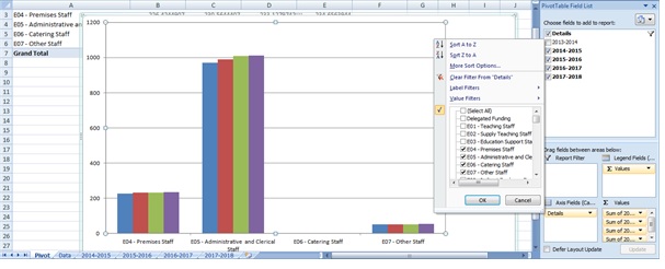
Next click on the down arrow to the right of the details at the top of the list. This will open another selection list which includes all the CFR codes. You can select whichever you like and this will bring up a chart. In the screenshot below I have selected non-teaching staff. The current data shows cost per pupil.
The next screenshot (below) shows teaching staff and delegated funding. The funding is getting lower and the cost of teaching is higher.
The next screenshot (below) shows teaching staff and delegated funding. The funding is getting lower and the cost of teaching is higher.

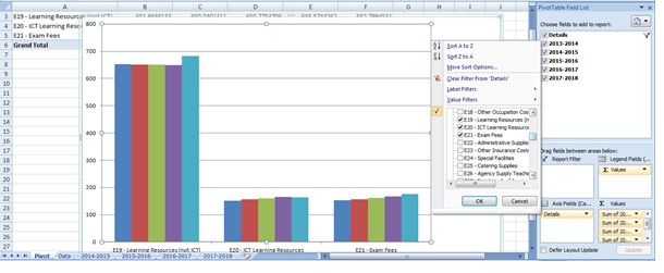
A further example (below) shows learning resources costs, ICT and exam fees. What is the reason for the large jump in learning resources projected for 2017/2018?